Skip to main contentContainer
The container component is one of pdf noodle key features, giving you superpowers to make your template look exactly how you want it. It’s super flexible, allowing you to craft even complex layouts without ever needing to write a line of code.

Layout
The layout properties will tell you how the children components will behave inside the container. You can change:
- Direction: vertical or horizontal stacking
- Align: on top, in the middle or on the bottom
- Justify: at the start, at the center, at the end, distribute evenly
- Gap between elements: none (0px) , small (12px), medium (20px) or large (40px)
- Horizontal margin: none (0px) , small (12px), medium (20px) or large (40px)
- Padding (internal margin): none (0px) , small (12px), medium (20px) or large (40px)
Design
With the design properties, you’ll tell us how the container should look. The options are:
- Height: fit internal content, screen height (ideal for one-pagers or covers), fill space (ideally if you have nested containers) or fixed height.
- Width: Full available width, fit internal content or fixed width.
- Background: solid color, gradient or image (more below)
- Border: none, full, top, bottom, left or right
- Border color (if border is choosen)
Container background
For the container background, you can choose from a list of solid colors, gradients or images, but it’s actually a lot mor flexible than that.
For the solid colors, you can type any HEX/RGB color or even type “transparent” and it will also work.
For the gradient, you can choose one gradient or create your own using the syntax linear-gradient(...).
For the image, you can either upload an image, using the upload button, or insert the url of any image using the syntax url(...).
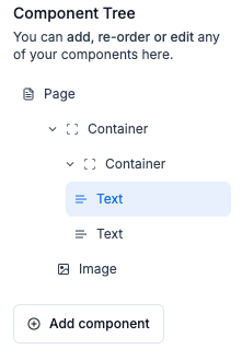
Stacking containers
The best part? Containers are stackable! Mix and match different layout options to effortlessly build your ideal design. Simple, powerful, and intuitive—just the way it should be.
Example:

Visibility convention
If you want to conditionally render a text component, you can set a variable that controls its visibility. When this variable is included in the variables payload, the component will display; if it’s absent, the component won’t appear in the final render. 