> ## Documentation Index
> Fetch the complete documentation index at: https://docs.pdfnoodle.com/llms.txt
> Use this file to discover all available pages before exploring further.
# Charts
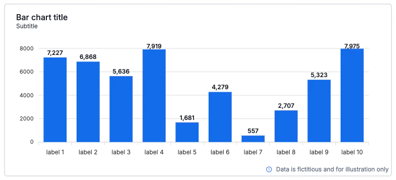
> Visualize metrics beautifully and fast. The Chart component lets you add six chart types, bind them to dynamic data, and fine-tune design details. Perfect for KPIs, trends, and comparisons in your PDFs.
 ***
### Supported chart types
***
### Supported chart types
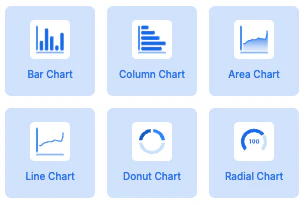 * Bar
* Column
* Area
* Line
* Donut
* Radial (Gauge)
We render charts with [**ApexCharts**](https://apexcharts.com/). For any
capability beyond what’s exposed in the UI, you can rely on ApexCharts options
(see “Options Override” below).
***
### Data & variables (dynamic payload)
Charts will be rendered using dynamic via payload.
* Bar
* Column
* Area
* Line
* Donut
* Radial (Gauge)
We render charts with [**ApexCharts**](https://apexcharts.com/). For any
capability beyond what’s exposed in the UI, you can rely on ApexCharts options
(see “Options Override” below).
***
### Data & variables (dynamic payload)
Charts will be rendered using dynamic via payload.
 Example (Bar chart) – output variable:
```json theme={null}
{
"bar_chart_title": {
"series_a": ["your bar_chart_title.series_a here"],
"labels": ["your bar_chart_title.labels here"]
}
}
```
* series\_a (Y-axis): numbers or strings that can be parsed as numbers.
* labels (X-axis): strings only.
Example (Bar chart) – output variable:
```json theme={null}
{
"bar_chart_title": {
"series_a": ["your bar_chart_title.series_a here"],
"labels": ["your bar_chart_title.labels here"]
}
}
```
* series\_a (Y-axis): numbers or strings that can be parsed as numbers.
* labels (X-axis): strings only.
#### Identifier → payload key
We automatically create the payload key from the Identifier (lowercased & snake\_cased).
Examples
* Identifier: Bar chart title → payload key: bar\_chart\_title
* Identifier: Monthly Revenue → payload key: monthly\_revenue
#### Multiple series
Add more series in Data → Add new series. Each series becomes its own array inside the identifier:
```
{
"monthly_revenue": {
"series_a": [1200, 1300, 1500],
"series_b": [900, 1050, 1100],
"labels": ["Jan", "Feb", "Mar"]
}
}
```
For example, if your identifier is Monthly Revenue, send a payload object under monthly\_revenue with series\_\* and labels.
**Series names and titles can't start with a number!** \ \ If you're series is
something like "2025 values", change it to "values - 2025", so the variables
can be properly set.
***
### How to use (step by step)
1. Insert a Chart and choose a type (Bar, Column, Area, Line, Donut, Radial).
2. In General, set:
* Identifier (drives the dynamic payload key).
* Subtitle (supports plain text; see Tips for HTML).
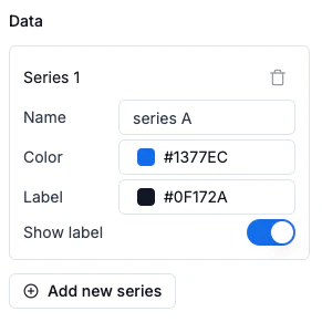
3. In Data, configure each Series:
* Name (legend/series label).
* Color (HEX).
* Label color (for on-bar/on-point labels when enabled).
* Show label (toggle data labels per series).
* Add new series as needed (not applicable to Donut/Radial which are single-series visually).
4. Bind dynamic data by sending the payload described above.
5. Adjust Design (see next section).
6. (Advanced) Use Options override for any ApexCharts option you need to fine-tune.
***
### Design options (UI)
 #### Layout
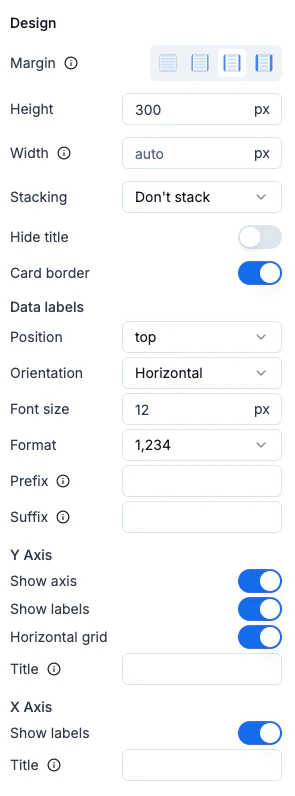
* Margin (Horizontal Margin convention):
* None 0px · Small 12px · Medium 20px · Large 40px
* Height (px)
* Width (auto or px)
* Stacking (Bar/Column): *Don’t stack* or *Stack*
* Hide title: toggle title/subtitle visibility
* Card border: toggle outer border
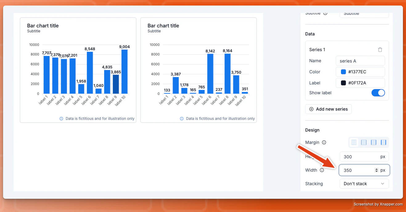
**Hint: If you're using 2 charts horizontally aligned**, it's recommended to set a width for each chart so they don't take more space than they should.
#### Layout
* Margin (Horizontal Margin convention):
* None 0px · Small 12px · Medium 20px · Large 40px
* Height (px)
* Width (auto or px)
* Stacking (Bar/Column): *Don’t stack* or *Stack*
* Hide title: toggle title/subtitle visibility
* Card border: toggle outer border
**Hint: If you're using 2 charts horizontally aligned**, it's recommended to set a width for each chart so they don't take more space than they should.
#### Data labels
* Position: top, center, bottom (varies by chart)
* Orientation: Horizontal or Vertical
* Font size: px
* Format: number format (e.g., 1,234)
* Prefix / Suffix: add currency or units (e.g., \$, %, kg)
#### Y Axis
* Show axis
* Show labels
* Horizontal grid
* Title (text)
* Prefix/Suffix (helpful for currencies or units)
#### X Axis
* Show labels
* Title (text)
***
### Visibility (conditional rendering)
If you don't send the chart variable on the payload, the chart won't be rendered, meaning the chart will be heading.
***
### Options Override (advanced)
Override any ApexCharts option via JSON for extra flexibility.
**How it works**
* We deep-merge your JSON with our defaults.
* Only the specified properties are overridden.
Example
```
{ "xaxis": { "min": 0 }, "yaxis": { "max": 100 } }
```
This sets x-axis min to 0 and y-axis max to 100 without affecting other options.
👉🏻 See all options: **[https://apexcharts.com/docs/options/](https://apexcharts.com/docs/options/)**
**Common overrides you might use**
```
{
"plotOptions": { "bar": { "borderRadius": 6 } },
"dataLabels": { "enabled": true, "offsetY": -6 },
"legend": { "position": "bottom" },
}
```
**Note:** Functions inside JSON are supported only when applicable in our
runtime. Prefer static options when possible.
***
### Payload Examples per Chart
#### 1) Single series (Column)
```
{
"monthly_signups": {
"series_a": [120, 140, 200, 180],
"labels": ["Jan", "Feb", "Mar", "Apr"]
}
}
```
#### 2) Two series (Line)
```
{
"active_vs_new_users": {
"series_a": [320, 340, 310, 360],
"series_b": [120, 160, 150, 190],
"labels": ["Week 1", "Week 2", "Week 3", "Week 4"]
}
}
```
#### 3) Donut (categories)
```
{
"traffic_sources": {
"series_a": [55, 25, 20],
"labels": ["Organic", "Paid", "Referral"]
}
}
```
#### 4) Radial (single value)
```
{
"target_completion": {
"series_a": [76],
"labels": ["Completion"]
}
}
```
**You can’t combine different chart types in a single chart right now** (e.g.,
line + column). It’s on our roadmap. If you’d like this, email
[support@pdfnoodle.com](mailto:support@pdfnoodle.com).
***
### F.A.Q.
* **Nothing renders?** Check you're sending the chart payload properly
* **No data labels showing?** Enable Data labels and/or per-series Show label.
* **Values look wrong?** Ensure series are numbers (or numeric strings). Labels must be strings.
* **Need a very specific tweak?** Use Options override with the corresponding ApexCharts option.